
In the previous post we learned about the Auto Snapshot why it is helpful to be able to visualize it while writing or reading DAX.
That’s all well and good, but how do you do it? I don’t have a pill for you to take, and the reality is that the best tool here is simply practice. That said, I can jump start your technique by giving you a peek into what things look like in my mind. That will be the topic for this last quick post in the series.
So without further ado, let’s get down to business it.
It’s Always About Cost With This Blog
To start, we’re going to be returning to our example from the third post in the series. The one about Total Cost. Here is what the Data Model looks like again:
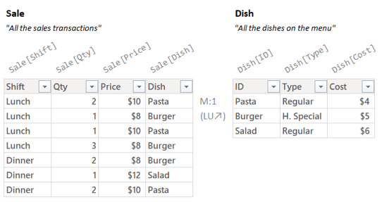
We want to think about a Total Cost Measure and the end result should look like this:

Here, again, is the Total Cost Measure:
Total Cost =
SUMX(
    Sale,
    Sale[Qty] * RELATED( Dish[Cost] )
)
So the whole point of this entire series is that when you see “Sale” above you reflexively don’t imagine the “Sale” table in the Data Model, but instead see the Auto Snapshot:

The truth is though, even with this small data set, the image in my head doesn’t look at all like what is above. I show you the high resolution image because it makes the explanations that follow clearer, but what I see is, well, it’s much fuzzier:

Just a fuzzy rectangle with about the right width and height; and a little divider for the Related columns. In my head, that’s what the Auto Snapshot produces.
If that didn’t give you an “aha!” moment, it might help if I zoom out and show you what the entire measure looks like in my head:

While much simpler than my fancy illustration in the original post but all the essential bits are there. In the top left are the filters in the Filter Context, to the right are the Model Tables with a relationship between them. Underneath is the Auto Snapshot and SUMX running the Per Row Formula for each row.
However, seeing it all at once is a little busy. Let me walk you through how you can start to visualize the above in a way that is not super painful.
It’s a Snap(shot)
So you don’t have to scroll back up, here’s that Measure again:
Total Cost =
SUMX(
    Sale,
    Sale[Qty] * RELATED( Dish[Cost] )
)
My eyes start by seeing SUMX. I know that we need to give SUMX a Temp Table (argument 1) and a Per Row Formula (argument 2).
My eyes jump to argument 1, the bit of code that needs to produce a Temp Table. What I see is just the reference “Sale”.
Because SUMX wants a Temp Table and not a Model Table, DAX is gonna do the conversion for me. Said otherwise, argument 1 the Auto Snapshot of “Sales”.
So, it’s an Auto Snapshot. How do I see that in my head?
First I imagine the Model Tables and filters from slicers etc. floating in my head:
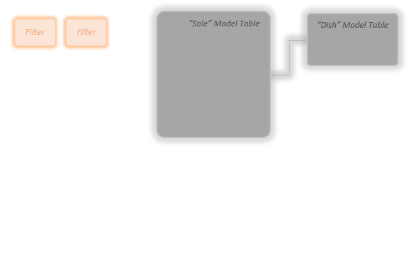
I don’t have to imagine what is in them, I just need to know they are there. Also, I don’t have to get the number of filters exactly right, or even the number of Model Tables. I just need to see that there are *some* Model Tables and there are *some* filters.
Now let’s start thinking about the Auto Snapshot proper. In my mind I think about the name of the table I’m Snapshotting sort of just floating underneath the Model Tables with the filters kind of looking down on it:
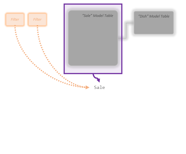
The word “Sale” underneath is the *request* for the Auto Snapshot. What’s the process look like?
OK. Step one is the Simple Copy. I imagine a slightly lighter gray version of the targeted Model Table appearing at the bottom:

Yep, there’s my simple copy. Next is the Mega Lookup, the Temp Table expands to the right, inflating outward like a balloon as the extra columns from Dish get added via the relationship:
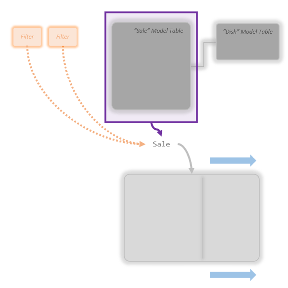
In this example I had just the 1 lookup table of Dish. If I had 20 lookup tables instead of just one, I’d imagine this getting really, really wide as it expands way out to the right. If I had zero lookup tables, it wouldn’t expand to the right at all. (Notice there is a little divider in my Temp Table so I can envision all the added “Related” columns as a different section.)
Don’t worry about trying to imagine the Temp Table getting wider by the exact right amount. Don’t open up Power BI and count how many columns are in both tables and try to imagine it “getting wider by exactly 74.23%”. Simply “The rectangle gets a little wider” is perfect.
Next comes Auto Filtering. The table at the bottom will shrink upwards as the filters from slicers etc. remove rows:

OK, the filters in the top left (orange things) have removed several rows. If instead of two filters in place there were four, I might have made the Temp Table even shorter. If I knew there were zero filters I’d leave it the same height.
Like before, don’t try and figure out exactly what percentage the table should shrink by. Just make it shrink upwards a bit.
So this is the Temp Table the Auto Snapshot produces:

Wow, stunning.
So maybe it won’t win any design awards, but its functional.
That fuzzy rectangle is all I need to see in my head. I can ignore all the stuff above it now.
Auto Snapshot and SUMX Walk Into A Bar…
OK, Let’s put that Auto Snapshot Temp Table into SUMX.
Looking back at the code:
Total Cost =
SUMX(
    Sale,
    Sale[Qty] * RELATED( Dish[Cost] )
)
SUMX is going to run the Per Row Formula in argument 2 for each row of our Temp Table from the Auto Snapshot. And looking at the Per Row Formula I can see that it makes two references to values of each row (“Current Row References” is our fancy term for these).
So next I imagine the Temp Table with two columns of little green boxes; those are the columns the Per Row Formula is using. I also imagine a column of little question marks; that’s where the number we get for each row will go:

Each set of question marks is where the Per Row Formula will run and come up with a number. Each one will “look to the left” to find the values of the current row to multiply together (the two green boxes for that row). One of them will be from “Sale[Qty]” and one will be from “Dish[Cost]”.
I don’t try to fill in the values here for the whole table. The green boxes and question marks are just *where* the numbers and answers for each row will go.
Importantly also don’t try to get the number of rows exactly correct here. Notice in my head I’ve guessed about three rows exist (3 question marks). If you got back to the previous chapter, you will see this is wrong, there are only two rows in the actual answer.
That’s OK though, my guess of 3 rows is more than close enough.
You are not a computer and you will not know exactly how many rows there are, but even a bad guess is good enough to properly see the *process* in your head.
Next, I don’t try to think about *all* the rows, I just zoom in on the first one and try and fill in some numbers for just that top row:

So I’m guessing for the top row the quantity is maybe 2, and the cost is maybe $5. The Per Row Formula multiplies those two number together, so the answer for the top row is $10.
Again, those numbers are not the real “correct” numbers, but they are close enough to let me work through the logic of the Per Row Formula. The reasoning in my head sounds like this:
“Hmm, let’s see; so 2 seems like a reasonable quantity of items someone might buy (maybe one for them and one for their coworker?) and $5 is a reasonable cost (a little bit of dry pasta and some sauce).”
Those “good enough” numbers are more than sufficient to see the process and guess at what a row’s answer might look like. I also don’t worry about getting the math right. 2 times 5 is very easy, but if the numbers were bigger I would just guess at what multiplying them together produces (“Maybe $200is?”)
So now I zoom back out and see the entire table and just imagine that the Per Row Formula has run for each row and hence produced a number for each row. I don’t try and guess at all the other numbers, I just let them be fuzzy in my head. Importantly though, I *do* guess at what summing up all the row’s number might be at the very bottom:

So I guessed that my final answer will be $25.
How did I come up with this number? I just told you, I guessed.
I just need some numbers so I can imagine that last step of the process in my head. Guessing the right number isn’t important. Making a guess is. Just imagine a number and very vaguely how big or small the number is.
In addition to letting you finish visualizing the process, it will give you something to compare against to see if your guess lined up at all with the real answer.
What was the real answer again? Ah yes:
So my guess was about $5 off, and that’s fine. If in my head, my guess was $3,000,000, then I know my visualizing is way off somewhere. If I’m close at all, I’m doing just fine.
And that’s it. That’s the whole process.
Still Way Too Hard Brian
OK, fair enough. I’d like you to be able to eventually do everything above, and it’s great to do as an exercise along with me, but it might still be too much when you’re starting.
Let’s simplify it as much as possible. Here’s that Measure you’re probably tired of looking at:
Total Cost =
SUMX(
    Sale,
    Sale[Qty] * RELATED( Dish[Cost] )
)
OK, to start off, SUMX wants a Temp Table and we’ve given it a Model Table. So we have to start with visualizing the Auto Snapshot.
Imagine a rectangle. OK, now stretch it to the right (for all the columns that get added), and shrink it towards the top (for all the rows that got filtered out.)
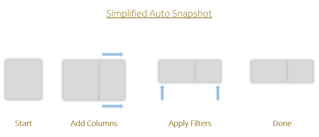
There’s your Auto Snapshot Temp Table. (If *just* the above is all you can do in your head after reading this article, that’s actually fine and a great start.)
Onto SUMX…
Start with the Temp Table. Now imagine, for each row, one or two green blips in the Temp Table and a yellow blip just outside. Those little green blips are the numbers used by the Per Row Formula and the little yellow blips are each row’s answer. Lastly imagine one big yellow blip which is the sum of all the little yellow blips; that’s the final answer.

There you go. There’s your super simplified way to properly envision a simple SUMX Measure.
It can be helpful to grab a pen and do this on a piece of scratch paper, or on the back of some junk mail, or on a 3×5 card, or anything else you can sketch on. If you have colored pens, go ahead an use them. If not, any single colored pen will do. Here’s my award winning rendition:

Blips inside the rectangle are the values of each row used, blips just outside are the results for each row, and the big blip is the final sum.
My Data Has More Than 7 Rows; A Lot More
Yep, in the real world the tables don’t have 7 rows, they have more like 70 thousand (or 70 million). Also there are lots of lookup tables and lots of filters. How do I envision that?
Here’s what a bigger, more complex example looks like. It’s pretty much the same, I just had to zoom out a little cause the tables are bigger:

The Auto Snapshot produces an extra wide Temp Table because of all the lookup/dimension tables. The green and yellow rectangles shrink down to just little dots because we’re zoomed out so far. But otherwise things are exactly the same. The above is a very good representation of what I see in my head when using SUMX on a bigger size data model.
As models get really, really big they still kind of look like above in my head. The point is not to get the size right, but to have a place in your head where you can think through the *process* of what your code is doing.
If you can think about it with small tables, you can think about it with big tables too.
Why Think About Things In This Way?
If this all seems very non-technical for a technical blog, consider the following:
The human brain has a whole section dedicated towards working through abstract problems. The brain also has a whole section dedicated toward keeping track of objects in three dimensional space.
The first section is amazing in that it can try to work through tricky abstract questions like “Why are we here?” and “What is love?”, but it can only hold a very small number of ideas at a time (about 3 to 5), scales very poorly, and often falls apart at the slightest interruption.
The second sections is the one that lets you pull up a 3D map of your favorite grocery store in your head and “walk up and down aisles” of a place you are not currently at. I bet you could close your eyes right now and walk in the entrance, grab your cart, and go to each sections dropping different groceries one by one in your cart. I bet you could even imagine more or less what your cart looks like in the end and how much the whole trip will cost.
This second part of your brain can’t handle tricky abstract ideas like “What is love?”, but it can keep track of where hundreds (or even thousands) of different products are kept at a grocery store. It only works with “keeping track of things in places” but it scales unbelievably well and doesn’t fall apart when interrupted.
The goal with all of this visualizing stuff is to help convince your brain that working with DAX is more like tracking items at a grocery store than it is like trying to ascribe meaning to all human existence. If we can shift the work of “understanding DAX” from the abstract reasoning part of your brain to the geospatial tracking part of your brain, it’s suddenly possible to keep track of hundreds of Temp Tables in your head just as well as you can keep track of the hundreds of products you want at a grocery store.
This won’t happen all at once; will be a hard skill at first; but practice, practice, practice, and when people ask you what a SUMX Measure is doing, you will be able to tell them with confidence because you can see what it is doing in your head.
Learning how to visualize the simple things is the first step into being able visualize more complex Measures doing fancier things. You’re on the right track though, give yourself a pat on the back.
Next time we’ll start looking into the concept of sub-formulas in earnest which will lead us into the tricky concepts of Row and Filter Context.
Till next time!
-BG
